BY STEVE WINSTON
From “The Best Arts Writing of the Decade,” hardcover edition, published by “American Artist” magazine
When Larry Gerber looks at a street in a ghetto in New York City, a lonely, backroad general store in Georgia, or a marketplace in Morocco, he’s more interested in the way he feels than what he sees. For that reason, he finds painting in a strict Photo-Realistic style unfulfilling. He believes such work lacks an intense emotional connection to the subject.
“My art is different,” Gerber says. “The Photo Realist attempts to replicate faithfully what he or she sees in the photograph. For me, the photo is just a road map; I may wind up in a completely different place, and I often have no idea where that place will be until I’ve completed the painting.”
Gerber adds his own emotions—what he felt when he took the photograph combined with his feelings while working on the painting—to the gritty urban and nostalgic countryside scenes he brings to life on his canvases.
“I’m expressing something, not depicting something,” he says. “I want viewers to share in my feelings, and I hope the painting will generate powerful emotions.”
Gerber’s alterations of the basic photo aren’t always extensive. They might consist of simple, subtle changes, such as adding delicate accents to a face to give the viewer insight into the subject. Also, since he is not trying to duplicate the reference photo when painting, his brushstrokes tend to be looser and more suggestive than those usually found in a Photo-Realistic painting. He’ll even sometimes work from a black-and white photo rather than a color one to avoid being overly influenced by a scene’s color.
This procedure further allows him to interpret the site according to what he seeks to express. As a result, he likes to call his work “Photo Expressionism.”
Gerber carries his camera with him everywhere he goes, even if he is out exercising on his bike. But to him, it’s strictly a tool for capturing the immediacy of the moment and a scene’s light and ambience. When he is photographing a location, he is not thinking about how the painting will look but merely recording something that has struck him.
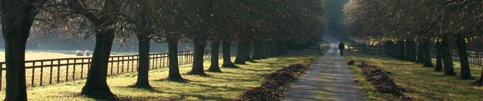
“For some reason, I’m often drawn to run-down areas or derelict old buildings, perhaps because they elicit the most emotion in me,” he says. After Gerber has chosen a photograph from which to work, he figures out the size of the painting, which depends on what he is trying to say.
“I then do a sketch on the canvas. I work on high-quality primed canvas, generally with paint but sometimes with a charcoal pencil. I basically outline the compositional elements in the photo but also delineate the forms and areas
of light,” he explains.
After completing the outline drawing, he puts the photo aside and looks at it only occasionally for reference. Gerber says this is a time when he has a panic attack.
“I have one before every painting I start,” he notes. “The novelist Ernest Hemingway once said for a writer, the hardest part is sitting down in front of that blank sheet of paper. And that’s just how I feel—especially because I’m not replicating a photograph, and I have no idea where my brush is going to lead me.”
His next step is to tone the entire canvas with a soft wash that doesn’t cover up the sketch. He uses a large, flat brush to apply the wash, which consists of a color compatible with what he hopes the finished work will be. Although the artist generally works from color photos, he will sometimes use a black-and-white one for reference so he can develop his own sense of color for the scene.
Step 1. Gerber started with a sketch done with dark-violet acrylic paint, which was basically an outline of the compositional elements in the photo but also delineated the forms and the areas of light. After completing the sketch, he put the photo aside and looked at it only occasionally for reference. He then toned the canvas with yellow using a large flat brush.
Step 2. Gerber next toned the background with warm greens and added cool shadows to the foreground to complement them. After the toning, the brushwork started to reflect the textures of the objects being depicted. He then established the middle tones that harmonized the lights and darks. Next, the artist emphasized the lights with opaque yellow, muted slightly with its complement. The strongest highlights (in white and yellow) came later. He also pushed the shadows with the violet complements.
The artist then lays in colors over the underpainting in order to develop a value pattern in the painting, with a focus on harmonizing the various elements in the work. Gerber says he’ll start on the purely technical aspects of a painting only after he’s loosened up with the brush.
Step 3. Gerber will splatter paint on the work at any time during the painting process. In this painting, the grass and tree textures were splattered with paint to lend a sense of spontaneity to the work. He used colors that would draw the eye back to the trees and forward to the grass. At this point in the painting, he worked on all the areas. He then increased the contrast to bring up the strongest highlights, the ones he wanted the viewer to see first. The muted highlights he rendered
earlier draw the viewer’s eye through the painting. Gerber knows a painting is finished when he feels all its elements are balanced and harmonious.
“I’ll experiment on the canvas with the colors for a while with what I like to call ‘pushing the paint around,’” he explains. “This procedure helps me further create harmony, especially with the spatial forms. When I finally start painting, the brush almost feels as if it’s on its own. At that point, the brush, the paint, the canvas, and I have become one.”
After establishing most of the painting, Gerber reinforces some of the darker patterns, even to the point of creating darks within the darks, again focusing on the painting’s unity.
“I never use black,” he notes. “It has a tendency to dull the color. This is also when I’ll try to pull out some of the light color. I hold off putting in the pure whites and darks until the painting is almost completed. At this point, the painting starts to ‘pop’ and I really have the opportunity to make the viewer see what I want him or her to see. I call it ‘popping the highlights,’ and it’s when I begin concentrating on the strongest highlights—where I want the eye drawn first—and then the secondary highlights, where the eye will travel next. I’m trying to render light through line, color, and form, creating abstract shapes that unite to establish a realistic illusion.
“Through the entire process,” he adds, “I’m striving to push the lights and darks in the painting as much as possible to make the painting livelier and more involving to the viewer than if it were just pure realism. The viewer will respond more emotionally to this kind of painting.”
But Gerber “Actually, I often have no idea whether or not I’m really finished with a painting,” he says. “I’m a hyperactive person, and my work tends to reflect that.”
At any point during this latter stage, Gerber might load his brush with paint and splatter the work’s surface in a controlled manner.
“I’ll use a variety of different splattering techniques, depending on the thickness of the paint,” he says. “But the effect of this procedure is not obvious. A viewer can’t see the splattered paint until he or she walks right up to the painting.”
When Gerber reaches the point when he thinks he’s close to finishing the piece, he’ll stop painting and put it aside for a week or two. When he returns to it with a fresh eye, he often can see what the work is lacking and whether or not it communicates the feelings he wants it to.
“I put myself in the place of the viewer,” he explains. “If I can walk up to the painting from a particular distance and see what at first appears to me to be a photo transforming itself into something else, something looser, then I know the painting is close to being done. But if it looks simply like a rendition of a photograph, then I go back to the drawing board.
“Also, I look at every color, and sometimes the addition of a strong red, for instance, will help draw out other, more muted reds. I’m also looking to reinforce the structural and linear values, as well as assure the painting is harmonious. If I think a painting is not working, I’ll sometimes let it sit for a period of time, even for two or three years. This happens when I just don’t know what to do with it.”
The artist uses a variety of brushes but likes the Winsor & Newton Series 7 brushes best, although he says they’re a bit expensive. “I buy brushes more for their shape and quality and how the paint flows when I’m using them than for their brand name,” he says. “To me, a brush is like a good or bad pen—the way it feels when I’m painting is its most important characteristic. But whatever brushes I use for a painting, they’re generally ruined by the time I finish because I paint with emotion and push very hard.”
Gerber graduated from the Art Center College of Design in Pasadena, California, in 1971 with a B.F.A. degree. He has exhibited his work at such places as the High Museum of Art in Atlanta, O.K. Harris Works of Art in New York City, and the Bacardi Gallery and the ArtSpace/Virginia Miller Galleries, both in Miami. His paintings are in numerous corporate and private collections, and he has done many commercial, editorial, and design commissions for major corporations, including IBM, Avon Books, Fawcett Books, Burger King, Disney World, and AT&T.
Steve Winston (www.stevewinston.com) has written or contributed to thirteen books, and his articles appear in major media all over the world. He lives in the Greater Fort Lauderdale, FL, area, and can be reached at .